Brush lettering and calligraphy are often two very confusing terms used interchangeably. While the latter is about writing letters in beautiful fonts, the former is about drawing beautiful letters. Brush lettering is where you use a paintbrush or a brush pen for hand lettering. As a beginner, it is easy to get confused with the overwhelming options in font styles and the various terms that you might come across. So, here is an easy tutorial to let you confidently venture into the art of brush lettering.
The thick and thin strokes
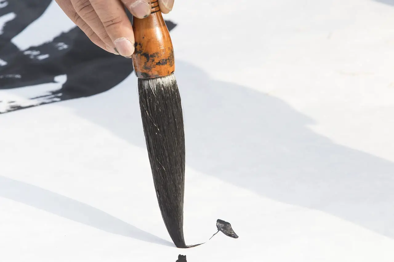
One of the very first rules to know about brush lettering is to apply different pressures to your pen for different directions of the stroke. Upstrokes are always thin and downstrokes are thick. If you already know to write in cursive letters you can try faux lettering by making all the downward strokes in every alphabet thicker than the upward strokes. Faux lettering can be done with any pen, pencil, or marker as you would only be manually adding width to your downstrokes. However, for brush lettering, you need brush pens or quality paint brushes that let you achieve different stroke thicknesses for different pressures applied.
It is all about the brush pens you choose
Not everyone can write with a paintbrush feeling fully in control of the strokes. You might notice subtle shakes in the letters. And not all paints let the brush glide on the paper smoothly. This is where the water brush pens with water reservoirs come into the picture. You can use them with watercolor pans and create beautiful letters. Another alternative to using these would be the brush pen.
A brush pen is a felt-tipped pen that looks like a normal pen and therefore even the beginners would be able to write with it easily. There are different types of brush pens depending on the thickness of the nib and flexibility of the nib. The large and flexible nibs might be slightly more difficult to control for the beginners. So, when you are just beginning your lessons in brush lettering it would be better to work with hard and medium tip options offered by many popular brush pen brands. The transition from thick to thin strokes would be easier when the tips are of medium firmness.
Once you have a great brush pen set, to begin with, pick smooth papers for practice. You cannot use your regular papers as these might end up fraying and damaging the sensitive felt tip of brush pens. Thick papers that are not too absorbent would work best for your brush lettering practice.
Steps to master brush pen lettering
1. Get the posture right
Holding your brush pen the right way is as important as choosing the right pen itself. Till you get the grip right, let your pen rest comfortably on the gap between your thumb and index finger. Never hold the pen upright. Alter the angle of the pen such that it is at 45-degree inclination with respect to the writing surface. It might approximately rest at the base of your index finger once you have aligned it with respect to the paper. This angle is what makes it comfortable to achieve the differences in the stroke thickness. Once you learn this, you would be able to apply the right amount of pressure for your upstroke and downstroke without straining your wrist or damaging the nib.
2. Master the basic strokes
Like calligraphy, with brush lettering, you can start with the basic strokes in order to understand the letter formation. However, you do not have to accurately replicate the letter shape and size in this case. The basic strokes you need to master are –
· Upstroke or entrance stroke
· Downstroke
· Overturn
· Underturn
· Compound curve
· Oval
· Ascending loop
· Descending loop
Each alphabet in lettering comes from combining two or more of these strokes. Only when you know the basic strokes would you know when to lift your pen up to create the perfectly shaped letters. Lowercase alphabets are all easy to learn once you have spent a considerable amount of time practicing these fundamental strokes. Look for printable worksheets and practice these strokes every day till you get precisely thin upstrokes and consistently thick downstrokes.
3. Use guidelines or dotted journals
Do not attempt brush lettering without drawing your guidelines. Most of the fancy lettering forms that you can learn later on come from experimenting with the way these guidelines are used. The four basic lines are-
· Baseline
· X-height
· Ascender
· Descender
Dotted journals with thick and smooth papers are very popular among brush lettering artists. These let you use the dots as guides not just for the height of letters but also for the thickness and spacing. If you plan to combine doodles with your lettering, dotted journals are convenient to work with. Even if it has been weeks since you started practicing lettering, stick with using guidelines. This would ensure that your letters are straightly aligned.
While creating block letters and to try some fancy fonts, you can alter the spacing between the guidelines. There are different variations you can use within the same block of words. This helps you create those quirky quote blocks you find in wall posters.
4. Learn individual letters before connecting them
One mistake that most curious beginners make is to jump right into connecting letters and forming words before mastering individual alphabets. You have to unlearn how you write cursive letters and learn to break each alphabet into a combination of the basic strokes you learned. This is the first crucial step to master brush pen lettering. Start with lower case alphabets and then practice upper case alphabets several times.
Connecting letters is the next major step. Connecting the alphabets without making the transition too visible is what matters. Start at the right gap from the exit stroke and apply gentle pressure for upward strokes and firm pressure for downstrokes. It is alright if your letters look crowded or cramped initially. This is the aspect you would be improving with consistent practice. Take it slow and start spacing the alphabets equally for a neater look.
Hunt for practice sheets
From social media platforms and blogs on lettering, you can easily find practice sheets. At the stage where you are still perfecting your fundamental strokes, practice sheets are indispensable. There are also many options for learning alphabet formation. Themed practice sheets let you practice different words confidently. With these, you can easily hone your letter connecting skills. They are effective in helping you understand how to maintain uniform spacing between alphabets.
Familiarize yourself with brush lettering jargon
Besides the terms used for the guidelines and strokes, there are other terms you are likely to come across while taking up lettering lessons. Flourishes are curvy extensions that are added to the head or tail of letters. You might even notice them placed before entry strokes or hairlines. Swash is similar to flourish but these are created as extensions to letters to add an ornate touch. These are even exaggerated versions of letter serif. Crossbars are the horizontal strokes you write in a few alphabets both in uppercase and lower case fonts. For connecting the letters like shared crossbars between multiple ‘t’s you use ligatures.
Lettering variations to try
1. Bounce lettering
Bounce lettering is a fun variation of casual brush pen lettering. This is where you extend the shoulder or the exit stroke beyond the usual guidelines. Going below the baseline or raising the level above the x-height are the popular ways to add bounce to letters. Bounce lettering is fun to create and you need to be creative to strike the right balance. Too much bounce can make your letters look oddly placed.
2. Theme of lettering
The spacing, slant of letters, and ornate details can be altered to create different moods or themes for the words. Sweet, romantic, whimsical, and bubbly styles are some of the most popular options you might come across. Based on the occasion and the quotes you are trying to letter you can create the desired effect by choosing suitable themes.
Extending your scope
Have you been working with brush pens and papers for a long time now? You can also venture into digital brush lettering projects. There are graphics editor apps that can be used on smartphones, tablets, and laptops. These let you create different lettering styles using a stylus or a digital writing pad for laptops. Make sure that you have a pressure-sensitive screen for getting the intended results. This lets you play with different color combinations and add different backgrounds. You can then print your project and use them to decorate your walls or frame them.
Brush lettering is not just for the artists who are looking to create wall art. If you have the habit of maintaining a daily journal or a bullet journal, you will find endless ways to use this art to beautify your journal. Given the many applications of fancy lettering, it is fruitful to learn it.