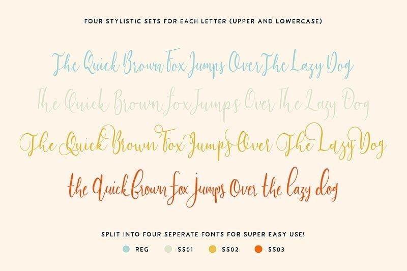
You must have heard of the term bounce lettering but do not know what means. Here is a guide to know all about this calligraphy style. It can be a vague terminology for many people. To put it simply, it refers to a bouncy lettering style rather than being rigid with your lettering style so that they appear on the same line.
It is a popular calligraphy style, which appears effortless and flowy. However, it actually is tougher than it appears. It is a lettering style, which can help in enhancing flare to the writing. It is regarded as a modern technique of brush lettering calligraphy.
Describing bounce lettering
It is a handwriting style, which you will frequently come across in Do-It-Yourself projects, bullet journals, invitations, pallet wood signs, or Pinterest among others. The technique is often linked to modern brush lettering or calligraphy due to the embellishments, which are included in the letters.
If you use this lettering style, the alphabets appear to be bouncing around. This fun writing form is an excellent technique to utilize your creative instincts. Are you wondering how this lettering style is distinct from normal handwriting?
The difference lies in its name because it is a lettering style where you violate the practice of straight-line writing. Rather, you include some form of variation to the letter positioning, and make them look as if they are bouncing. While the lettering style is full of personality, it is also great fun and whimsical.
The best part is you can make it work no matter what tools you possess. Today, this lettering style has emerged as a popular style in the community of designing and hand lettering. However, before you get acquainted with the technique of this lettering style, you have to get familiar with the writing mechanics.
As mentioned earlier, it can take time to master this lettering style. You will need some time to practice the art of creating bouncy lettering, which looks effortless and fluid. However, you will find it is worth the effort to master this useful and trendy lettering style.
Anatomy of letters
In order to accomplish this lettering style, you have to violate some usual lettering rules. Also, you have to understand and know them well to violate them.
If you want to get familiar with lettering, you have to be perfect with the basic letter anatomy. Typically, there are 5 different parts of a letter one has to be familiar with, which are mentioned below.
1. Baseline
It is obvious from the name that the line forms the base for the letters. The line is used for keeping all the letters straight, as well as, in-line with each other. The letters should sit on the baseline except when there is a descending line.
2. Cap height
The line offers structures for the letters by making them contained. It is how a writer can ascertain the height of the letter. Just like the baseline, the line acts as a guide to indicate where any letter should pause on the top.
3. X-height
It is a dashed line one finds on the handwriting paper. The aim of this line is to assist a writer to get familiar with the required height for small alphabets.
4. Ascender
Earlier, an ascender line was utilized for guiding the letters that have vertical lines such as b and k. Some people, however, use the cap-height for determining where such letters’ vertical lines should end. Both forms are acceptable.
5. Descender
The line is used for denoting where the alphabets with descending line should stop. An example of such a letter is p.
How to apply bouncing lettering?
The idea of accomplishing this lettering styling is to violate all these rules mentioned above. So, this lettering style is about going against the normal writing principles to make the writing look whimsical and not perfect. In order to accomplish this, a writer has to write his/her script by moving outside all the lines we defined above. Your goal should be to have the liberty of going out from where the writing should normally appear.
Breaking the norms
You might have understood by now that the alphabet should be sitting on a straight, clean line. Now, you have to get acquainted with the way of breaking those rules. Bounce lettering rejects the notion of writing all the alphabets on the same baseline.
Rather, each alphabet should jump slightly higher or marginally lower than compared to the baseline to form a bouncy effect. Typically, all the alphabets will be still of the same size more or less. It means that all the letters’ X-height should be around the same although they are not placed on the same row.
Make attempts to accomplish balance
It is imperative to note that there is no particular wrong r right way to accomplish this lettering style. The writer has to assess what looks most suitable for him/her. Yet, one point they can focus on while using this lettering style is the words’ balance.
In case, some one has to draw any line through the center of a word, it has to be ascertained that adequate weight exists below and above that line. In case, the writer has too many alphabets dipping low while not having enough to balance, the output may appear a bit off.
We suggest you focus while applying this lettering style to make an attempt to counterbalance the last 2 alphabets instantly. When there are a few alphabets bouncing high, you need to ensure that the following few strokes should be low so that there is a proper balance.
There will be occasions when you have to resort to improvisation while you are in the process of your lettering. When you practice for some time, it will be simpler to have the knowledge of balance. You can also find out what will work best.
Tips and tricks for practicing bounce lettering
As they say, a practice can make you perfect. So, try fresh combinations for lows and highs, again and again, to finally come to a bounce, which is pleasing. You will initially come across occasions when something you have created just does not appear to be working. You need to learn your lessons from these bouncing mistakes and try again to create something better. Check out these tips to practice your sessions.
Draw a line
You can draw a line to utilize it as a central reference point in the word. It will help you in keeping a tab on your lettering balance while practicing.
Make bold and big bounce
While you are getting acquainted with the style, it will be useful if you make bold, big bounces so that there is a feel for this style. Also, it is more difficult to practice if it is kept subtle. So, let the alphabets bounce around so that it is easy to play with the word’s balance and the shape.
Give more reach to the letters
Your letters should have a greater reach so that the bouncing effect is more prominent. If any alphabet starts with an ascender or upstroke, let it jump high. Alternatively, when it ends with a descender or a downstroke, it should dip more dramatically. It will give an additional bounce to the letters and also offer a playful effect. Doing this will also enable the writer to have more leeway so that cursive letters can be connected to one another.
Be more dramatic with shapes
Allow the letters to have a slightly dramatic touch. After all, bounce lettering offers excellent times for letting your style get loose.
Offset double letters
It is important to note that double letters may be marginally more intimidating. In case you do not apply caution, and they are excessively close, the entire bounce of the word can be thrown off. Instead, you should start the initial two alphabets of the word a bit high.
Thereafter, slot the second alphabet below. Alternatively, simply go the reverse way. That means you need to start low and then end high. You have to simply ascertain that there is a proper bounce between this pair. You would be fine then.
Do not bother about weight
Are you new to the concept of brush lettering? If that is so, there could be temptations to use a brush pen to try out the bounce lettering style. There is no harm to try this out and yet you may realize that it can make both practices tougher.
You may go for a felt tip or a bullet tip pen rather than using a brush pen to practice this lettering style. After you get accustomed to the bouncing’s ups and downs, additional complications of line weight can be added with greater confidence.
Conclusion
To conclude, we may say that it is essential to violate the rules to get the desired effect of bounce lettering. We have to also go against the guidelines that we have been practicing while writing. The ascenders of the letters should go higher while the descenders should go lower. Also, do not worry about maintaining a consistent baseline.