Edward Johnston was born to Fowell Buxton Johnston, an officer of the 3rd Dragoon Guards, and his mother, Priscilla Buxton, on February 11th, 1872.
He is widely regarded as the one who invented calligraphy. Modern calligraphy at least. And he was regarded as a master calligrapher that has continued to influence the field to this day. His impact is widely observed in England and Germany, where his works are revered more than any other place.
His name is synonymous with calligraphy, and his most famed achievement is designing the sans-serif Johnston typeface that went on to be used throughout the London Underground system for decades.
In an era where all signage was different, Johnston alone applied the standard proportions of Roman capital letters to his typeface. He gave birth to a lettering that was elegant and simple for all commercial use. Originally, every station had different platform walls fitted with the advertisements of different goods and services, along with railroad-specific information meant for all station customers’ perusal. This lack of uniformity in the typefaces all over the London Underground made it look disjointed, unprofessional, and sometimes even illegible. There was a need for signage that was easily identifiable and understood. This is what Johnston brought to the London Underground, and his typeface became the flagship typeface for all of Britain soon enough.
Edward Johnston was born in San Jose Uruguay but his family returned to England when he was just three-years-old. His childhood was unconventional. He was mostly brought up by his aunts who kept him locked indoors as they had a phobia about the fresh air outdoors.
This led to Johnston developing quiet, introspective hobbies and he took to the arts and crafts well.
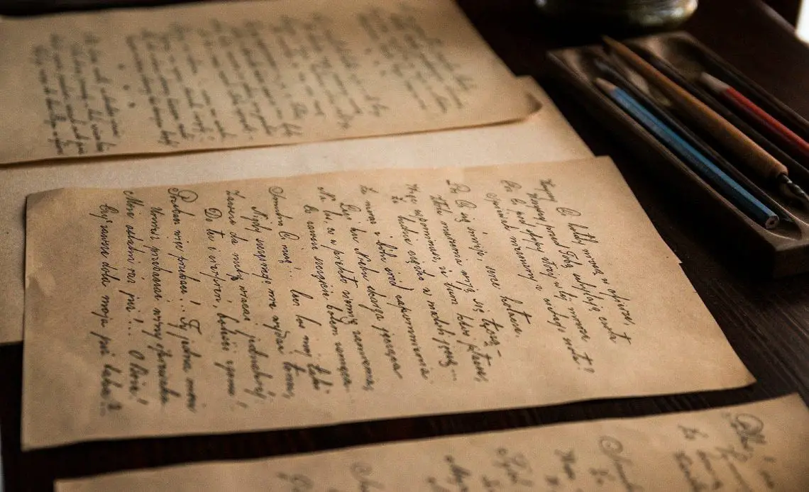
As a child, Edward had taken to the popular hobby of “Illuminations” which was the copying of texts in the format of a medieval manuscript. His love for the arts started at a young age, but he went on to pursue medicine at Edinburgh University. He studied medicine for a short while before deciding his heart wasn’t into it and left for an art career instead.
A man named Frank Pick managed the London Underground at the time. He hired Johnston to bring the various advertisements and signage in the Underground to the modern age. With a standardized typeface that could differentiate between signage and advertising and bring a new sense of professionalism to the station.
The new typeface was a complete success. Frank Pick was able to re-brand the London Underground and the London Bus networks. The entire public transportation network was changed overnight, with easily identifiable information throughout, leading to fewer errors and improved communication. Edward Johnston became emblazoned in history as he who invented calligraphy once again, and brought back a dying art to the forefront of modern commerce.
He met William Richard Lethaby in London, the founding principal of the Central School of Arts and Crafts.
Lethaby was so impressed by Johnston’s written illumination work that he urged him to continue his studies in a place more worthy of his talent, in the British Museum.
He would study Roman Renaissance lettering during his time at the museum and make new strides in his research.
He studied manuscripts with passion and upon his dismissal, he was soon offered a position teaching Illumination at the Central School.
Johnston then spent nearly four decades teaching, and held a post at the Royal College of Art as well. He focused on shifting the attention away from decoration and back to materials.
His course at the Central School would ignite the old art of lettering and give him widespread fame and respect. He breathed new life into the field of calligraphy. If you asked anyone in Johnston’s times, “Who invented calligraphy?” The response would come back: “Edward Johnston” as he had brought back the dead field with the jaws of life. He wrote the book, Writing and Illuminating, and Lettering in 1906 which became the bible on calligraphy and lettering.
His Legacy and Influence
Edward had a simple round calligraphic handwriting style that made use of a broad pen. In today’s nomenclature, this is known as the foundational hand. In Edward’s time, this method of lettering was known as a slanted pen hand.
His work influenced several generations of typographers and calligraphers.
Edward understood what made formal writing tick and was able to understand how all lettering blossomed outwards from the fundamentals.
His insight into the bare artistry of the craftsman is preserved well in both his book, Writing and Illuminating, and Lettering. And also within the halls of the Society of Scribes and Illuminators.
This society was established after his teaching days and is considered to be the foremost calligraphy society of its time.
His most famous protege, Eric Gill devised what is known as the Perpetua and Gill Sans, which are some of the most popular types used to this day.
Sir William Rothenstein once visited his school and remarked, “In Germany in particular, the name of Edward Johnston was known and honored above that of any artist.”
Rothenstein was one of the most famous artists of the 1890s, who became the principal of the Royal College of Art and was knighted for his dedication to the arts. Even he agreed that the one who invented calligraphy, or re-invented calligraphy, was indisputably Edward Johnston. Such was his reputation among the foremost artists of the time in Britain.
Even Hermann Zapf remarked that no one else had such a lasting effect on the revival of the contemporary field of writing such as Edward Johnston. He paved the path forward for the lettering greats of the 20th century and they all, in turn, owe a portion of their success to Johnston’s incredible work.
The 1970s saw a burst of interest in lettering owing to Johnston’s calligraphy. Professionals and amateurs alike celebrate his name during the annual lettering conferences held throughout the world.
The art of formal penmanship had been lost to the world for several centuries until Frank Pick decided to commission Johnston for the Underground Electric Railways Company of London.
The period of his time noted his typography and gave new life to the mid-20th century typography movement.
His undying work is celebrated throughout the world today, from signage on the London Underground to the modern digital age.
The Typeface

Johnston’s typeface has different names, but is widely known as the Johnston Sans. Eric Gill developed the typeface Gill Sans based on the initial work Johnston pioneered. It was criticized during its time for being too similar, but they are both considered modern classics today, outlasting their critics.
The simple style of his lettering announced a precision and purity in his typeface.
Johnston was a determined purist, simplifying the Roman letters to their simplest particles and constructed a font that was aesthetically appealing and precise enough to be considered for commercial lettering.
His typesets were nothing short of perfect, requiring very little alterations after its completion.
The Johnston Sans has only ever been updated once. But for more than a century, it has held steadfast against the passing typefaces of the century. It truly represents the very best of contemporary London and British typography.
The typeface is based on Roman square capitals and lower case traditional serif fonts. Johnston had a fondness for Roman capitals and felt them to be supreme among typefaces for their simplicity and elegance. They were to be reserved for the most important and attention-catching inscriptions and were similar to the designs of William Caslon’s works in the 18th century.
Johnston’s typeface broke the norms of what was considered popular during his time. The squarer shapes during his time, known as grotesques, have little influence on his lettering.
It is a testament to Johnston’s genius that his typeface is considered a mishmash of irregularities yet still successful. For instance, the capital-form ‘Q’ in displayed in a lower case and a simple single-store ‘A’ the likes of which are seen on the Futura typeface.
The typeface was unlike the sans-serifs during his time period, taking what was considered the “corruption” of the 18th century sans-serif and remaking it into a “bold” modern lettering.
The Johnston typeface was always intended for large, prominent signage. As a result, it was never intended to be used with italics. There is no true successful italics alternative to the Johnston. Different designers took to different methods to achieve a proper Johnston typeface that was as aesthetically perfect as the Johnston was in regular lettering but struggled. Till today, there isn’t a single typeface that incorporates Johnston’s works into what is truly considered an italics-based successor to the Johnston sans.
Justin Howes remarked that Johnston’s typeface was “the first typeface to have been designed for day-to-day use by a leading artist-craftsman.”
The Johnston sans came with two normal weights: Bold, and ordinary. The font family carried different names in its early years, such as the ”Underground,” ”Johnston’s Railway Type,” until it came to be later called as simply “Johnston”.
It broke the confines of London to go international and became ubiquitous throughout the United Kingdom for information and advertisements. In modern times, the Johnston can be seen as way finding signs for the London 2012 Summer Olympics and the Summer Paralympics.
It changed the world for the better and continues to be widely used till today.
The art of calligraphy may have been invented by the Ancient Chinese millennia back, but Edward Johnston is widely known as the father of calligraphy. Or at least as he who invented calligraphy in the modern form we witness it in today.