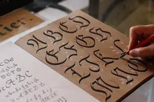
Copper calligraphy is associated with the Renaissance movement. The Apostolic Camera was demolished when Rome was ransacked in 1527. Most of the writing masters fled to other regions and created new scripts. The scripts became redundant rendering government officials unable to decipher all the documents that reached them. Standardization of scripts was introduced to tackle the issue and ‘rhonde’ was a widely accepted script. English publishers adapted ‘rhonde’ and refined it into what is known today as English round hand. Since then many adaptations of the round hand became popular with calligraphers and came to be classified under the copperplate family of scripts.
This calligraphy script with its rich history has an old-world charm much appreciated by many. Copperplate calligraphy has great demand compared to other scripts. Calligraphy enthusiasts invest time to learn the skill with fantastic results. Let us try to find proven methods to become a master of copperplate calligraphy.
What Are The Materials Needed By A Beginner?
Copperplate calligraphy is a traditional calligraphy using a particular clan of script types. All the tools used to learn conventional calligraphy are put to use in this instance too. The rudimentary materials that are needed include:
i. Writing paper.
ii. Nibs.
iii. Pen.
iv. Ink.
Experienced calligraphy masters suggest using an oblique pen holder rather than the straight holder. It is easy to write slanted scripts like the copperplate calligraphy with an oblique pen holder.
Preparing Your Writing Tools
We are using paper to practice and perfect our writing skills. A low absorbent paper that will not allow ink to spread is a good option.
Before starting the basic lessons, the following materials are also required:
i. Pencil.
ii. A rolling ruler.
iii. Eraser.
OK, now let us learn to put them to use.
The Pen- Hold It Correctly
Copperplate calligraphy is a bit different from normal writing on a piece of paper with a pen. Your style of holding the pen may need a little amendment for better results achieved through a harmonious pace of writing and sustained rhythm. Follow the below steps for faster results:
i. The thumb should be facing in the same direction as the nib. This is pulled off by placing the forefinger at the bottom of the pen holder. This will automatically place the thumb in a parallel position with the nib- remember, we are using an oblique holder.
ii. After achieving the first step, note the position of the third joint of the forefinger relative to the pen holder. The third joint is where the finger joins the palm and is known as the metacarpophalangeal joint. Make sure that the pen is resting against this joint. This will maintain a firm hold on the whole apparatus disallowing any random motion that can spoil your writings.
iii. The tip of the thumb should be at the same level as the first joint of the index finger. If you are right-handed, the thumb will be on the left side of the pen holder. The thumb should not be touching the index finger- this can harm the calligraphy script that you write.
iv. Now let us look at the placement of the middle finger. Place it in such a way that the first joint is in contact with the pen holder on the right side. The finger will be almost parallel with the thumb but pointing in the opposite direction towards the writer.
v. The ring finger and the small finger will be in a comfortable position touching each other and curled inwards. These two fingers shall also touch the paper while writing. This will give you better control over your strokes.
The Posture: Sitting Correctly
The way you sit directly impacts the way your copperplate calligraphy writing looks. Your posture plays a paramount role in your writing and yet many novices ignore it. Your posture has a direct bearing on the below faculties that are very important for a skilled writer:
i. Balance of your body.
ii. Eyesight.
You can achieve the best posture by practicing the following steps:
i. Keep your spine erect with the back of the head in the same line as the spine.
ii. Lean your torso very slightly towards the paper on which you will be writing.
iii. Both your feet should be touching the floor.
iv. Knees should at a right angle with your thighs.
v. Ensure that both your hands are placed on the table with the right hand holding the pen. The ring and index fingers should be touching the paper as mentioned above. The left hand can hold the paper or book to keep it from skidding away from you as you write.
vi. Place your elbows perpendicularly at the edge of the writing-table. It is better to avoid using a round table.
What Should Be the Size Of What You Are Going To Write?
The size of letters should correspond to the nature of the matter which means that there is no fixed size. However, copperplate calligraphy places a lot of significance on the ratio of each letter. Let us have a look at each aspect:
i. Letter height: The middle portion of a character is called ‘x’ for easy comprehension. The top portion will be 1.5 times the middle part equalling ‘1.5x.’
The size of the lower part will be the same as the upper part, that is ‘1.5x.’
So the ratio can be summed up as “1.5x:x:1.5x.”
ii. Minuscules: The size of the lowercase letters will be x.
iii. Descenders and ascenders: The bottom ratio applies to descenders. The ratio for the top part applies to ascenders.
Real Examples For Ratio
i. Letters similar to a, o, c, e, i, u, v, etc. should have ‘x’ height.
ii. Letters similar to h, k, l, and all capital letters will have the upper portion equalling ‘1.5x.’
iii. Letters similar to g, y, j, etc., and a few capital letters like J and Z will have their lower portion to be equal to ‘1.5x.’
Use a Real-Life Measurement
Let us look at an actual reference by using a common unit like an inch. We will attribute the height ‘x’ a height of an inch, so the other aspects of the letter will be:
i. Ascender: 1.5 inches.
ii. Descender: 1.5 inches.
This means that the actual height of a letter like ‘J’ will be 3.5 inches.
The Angle Of Letters In Copperplate Calligraphy
All copperplate typesets are distinguished from other fonts due to their angles. They slope towards the right in the range of 520 to 600 from the baseline.
Keep in mind all the above before writing. Let us move forward now.
The Fundamental Strokes And Basic Rules
We learned the below two techniques to achieve the correct angle by making the nib to follow the exact angle of the letter:
i. Holding the pen correctly.
ii. Using an oblique pen holder.
A smart technique used by experienced copperplate calligraphy writers is to adjust the page to make the nib point in the direction that the angle of the lines should follow. Instead of twisting your wrist to achieve the slants, you twist the paper.
Applying The Right Pressure
Correct shapes of letters are achieved by applying pressure in the following way:
i. Upstrokes: Make them with thin strokes without pressing the nib.
ii. Downstrokes: They should be thick and is done by pressing down with the pen to create thicker strokes.
Group Of Letters And Basic Strokes
The letters of the English alphabet are classified into distinct groups. Almost all letters in a group conform to a similar shape and correspond to the same fundamental stroke. This rule does not apply to a particular group that contains the letters r, s, x, and z.
There are seven basic strokes used to write small letters except for these four letters. The first task in learning the fundamentals of copperplate calligraphy would be to master the seven fundamental strokes. Learn these basic strokes with practice and you shall achieve the base to become an expert writer.
The Seven Fundamental Strokes
The names of the basic strokes are:
i. The entrance stroke.
ii. Oval stroke.
iii. Under turn.
iv. Overturn.
v. Compound.
vi. Ascender.
vii. Descender.
All these strokes can be achieved by alternating between upstrokes and down strokes. Always make sure to create these strokes within the specified range of the angles mentioned above.
Create Letters From Strokes
Practice the strokes for enough time to be able to recall them instantly. Now we can use these basic strokes to create letters. Let us take the example of the lowercase letter ‘h.’
Create the sixth stroke ‘ascender’ and follow it up with the fifth stroke called ‘compound,’ and you just wrote your first copperplate calligraphy letter. Congratulations!
Tip: Always begin a small letter using an entrance stroke, the first among the basic strokes.
Practical Examples
Let us get on with the practice with three more lowercase letters.
i. The letter ‘g’ can be achieved by: oval + descender.
ii. ‘m’ = Overturn + overturn.
iii. ‘u’ = compound + under turn.