Making an impact with an ad is much tougher than we might think. Not just the content of the ad but a lot of other factors too play a very crucial role in making the ad powerful. From the graphics you use to the color palettes and yes, even the fonts you use in your text.
This might seem like a very trivial matter, but fonts do influence how a customer comprehends your ad. For instance, you must have seen how most horror movies in the past used the Gothic fonts or how lighter material like children’s books would use Comic Sans. That is because these fonts can trigger the exact kind of emotion that you are trying to build up in the reader’s mind.
So, whenever we think of something fresh what first comes to our mind? Clean air, greenery, budding flowers? We relate freshness with nature. And that is why, when you want your ads to look fresh you should try and use fonts that resemble nature and its purity.
Here we have compiled a list of some of the best nature related fonts that can give your ads the fresh look they need.
Summer’s Country Coffee Pots Font
We usually enjoy nature best during spring and summer seasons. The Summer’s Country Coffee Pots Font is perfect to capture this freshness in your ad’s text. The font is a simple yet beautiful blend of florals and clear text. This just has to remind the reader of a weekend flower market in the countryside.
It is perfect for banners, flyers and visiting cards too. This can be an exceptionally good font if you are in the flower business or own a flower shop. It would be perfectly relevant, fresh and charming at the same time.
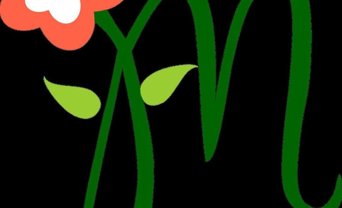
Peomy Brush Font
The Peomy font, created by artists Ieva and Krisjanis Mezulis, is a beautiful flowy font that is inspired by forests and fields. The characters in this nature font are created with brush strokes using a fude brush filled with thick black ink and painted on a smooth pastel paper.
The font is also accompanied by a large collection of nature inspired doodles, vector graphics and logos. These include tiny leaves, wreaths, twigs, songbirds and many more. Overall the font looks very charming and truly gives a feel of the forest and its elements.
Way Gardens Font
The Way Gardens Font is another flowery font that looks very fresh and out of the ordinary. In this font the flowery embellishments are incorporated with the characters themselves making them look like one continuous graphic. The beautiful swirls in the characters that often start or end with a flower detail, give them a crafty look.
This nature font is perfect if your ads are for baby products or even younger kids as this has got a very nursery kind of vibe to it. But even if you don’t deal in kids’ products, you can still make use of this font if you are looking for something innocent and quaint.
Organic Fruit
This font is inspired by the plump, round silhouettes of fruits and hence the name Organic Fruit. Well, we agree that the font does remind us of something fruity. This font offers only lowercase letters. You can’t have uppercase characters or numbers. But for a simple playful ad, these are more than sufficient. The letters are easy to read and distinct. Though they are perfect for ads for adults and children alike, they would definitely be more apt for the latter.
Flash
Flash font, created by George Williams, is quite different from the other fonts we have discussed so far. When you think of nature inspired fonts, you would usually think of leaves or flowers. The Flash font, however, takes inspiration from a related element but is still completely unique. This font looks inspired from wood. The letters resemble wood and look like they are carved out of wood.
Though you get only uppercase letters, a few special characters and numbers, you won’t miss the lowercase letters much. That’s because the font has a large and a small size of the uppercase that gives the required variation to text. The font in itself is blocky and squarish. That makes it great for use in banners and billboards as it should be visible from a distance.
Bamboo Brisk
Bamboo Brisk is a very simple, rugged looking font. How is it related to nature? Well, it was actually created using bamboo pens. So it is definitely nature inspired. The bamboo pens gave the text an uneven finish making it look natural and rustic. This nature font also retains the slenderness of the bamboo plant, added by the long and thin strokes used.
Though the font has only uppercase letters, it doesn’t look too overwhelming because of slenderness. This could be a great option for something that you want to look handwritten and imperfect, yet neat and easily readable.
Touch of Nature
Touch of Nature is a font inspired by marine life. Very different from the other nature fonts, this font incorporates some tiny fishes inside the lettering itself. The font only has uppercase letters, numbers and a few special characters but it works just fine without the lowercase letters too.
The font is blocky with imperfect and slightly rounded edges, which gives it a cartoonish feel. It is a good choice for ads published by sea life centers or aquarium stores.
Tree Like
The Tree Like font would definitely remind you of fantasy stories with huge branched trees that grow in all directions. The font is made to look like trees or parts of a tree with twigs and branches growing out of the letters, with a wooden appearance. The warped and twisted font is a thing straight out of a fairytale and is perfect for fantasy settings.
This nature font only offers uppercase letters but you can choose between different backgrounds. You can have your letter enclosed in a square with a black outline, or get a negative film kind of look with a white letter in a black filled square. You can also use a stand-alone letter without the box. Tree Like only offers uppercase fonts.
Garden Party Sans
If you are looking for something minimalistic, elegant and clean, Garden Party Sans is the font to go for. The elements used in this font are very sleek and minimalistic. The uppercase letters in this font have some beautiful hand drawn tendrils and flowers entwined with them while the lowercase letters are just slender plain letters. When typed together in a word, the ornamental uppercase and the plain lowercase letters give the text a very elegant look.
This font is just perfect for a classy banner or a print ad.
Wild Growth
This font indeed stands true to its name. Wild Growth is another whimsical looking font that would remind you of a witch’s lair or an abandoned house in a fantasy story. As the name suggests, the letters in this nature font have branches growing out of them haphazardly, much like wild creepers growing on an abandoned house.
You get the whole set of uppercase and lowercase letters, numbers and a few special characters. The “wild growth”, however, is only available on the uppercase letters. The lowercase letters are simple but slightly whimsical in the way the strokes are made. You can add more details to the text with the special characters.
Flower 3
What is most striking about the Flower 3 font is its simplicity. The font uses light incomplete strokes to create the letters, which many a times look like very sleek leaves. One stroke in each of the uppercase letters ends with a plain looking flower. The lowercase letters use the same strokes but without the embellishments.
This is a sleek font that looks extremely neat and charming. It would look perfect in ads related to gardening, agriculture or even florists’ shops. If you prefer fonts that are clear and not too embellished, you would surely love this one.
Moon Star
Again a font that delivers just what it says. The Moon Star font is basically all moon and stars. The letters in this font are made up of crescent moons and are adorned with stars. This rounded moon-like font looks fun and whimsical and would remind you of astronomical signs or space exploration.
The font has all uppercase and lowercase letters, numbers and special characters.
Flower Sketches
Flower Sketches is a very innovative font style that creates the letters out of a potted plant. The letters look pretty ornamental and more like illustrations than a font. These can go perfectly well with other illustrations and make beautiful banners and store signs.
The font has only uppercase letters, though, and a few punctuations.
Flame
This Flame font is literally letters with flames on top. The fiery font is good for use in businesses that have anything to do with fire, say a BBQ restaurant. The letters are blocky and prominent. You get uppercase letters, lowercase letters, numbers and quite a few special characters. Try out these nature fonts and freshen up your ads and banners.